style master css tutorial
Creative use of images
In this section you will learn
- the
heightproperty - the
background-repeatproperty - the
background-positionproperty - the
paddingproperty
Project goals
- To add a little bit of dynamism and interest to the design through creative use of images.
- To make the text in
#headerand the#main-textlook better by adding some space between the content and the border of the element.
<< 9. page layout | 11. descendent selectors >>
While you'll have to admit it's showing potential, you're probably also thinking the page still has a bit of work to be done on it. All true, but don't forget to give yourself a pat on the back for all the things you've already learned and put into practice. Let's leave the navbar for the moment, we'll come back and style its contents last of all. For now, we're going to go back and put in those images that we talked about earlier.
Open index.html and have a look at what's in between #header and #content. You should find two <div> elements, with the ids outer-image and inner-image. You should also see that inner-image is completely contained by outer-image, but that there is no actual content in either of them: that's why you can't see them on the page at the moment. However, if you give an element a background-image, and a height then it will appear on the page regardless of the fact that it has no real content. That's what we're going to do now.
Exercise 41
Create two new statements with id selectors, one for outer-image and one for inner-image. Style Master users will find these two are already in the style sheet.
#outer-image {
}
#inner-image {
}
We create the effect you see on the finished page using two separate images, called outer-image.jpg and inner-image.jpg.
Exercise 42
Copy the images below into the images folder you created before.

Figure 11: Background image for #inner-image
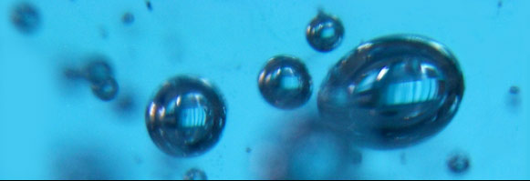
Figure 12: Background image for #outer-image
With CSS you can attach a background-image to any element, not just the <body>. This simple fact opens up a whole world of design possibility. I mentioned before though that you need to give the element a height so that it will actually be drawn on the page and any background-image you give it will be seen.
The height property
As you might have guessed, height is similar to width, and takes the same sorts of length values. Again here, we're going to work with pixels. We want to make each of these two elements the same height as the images they are going to display, which is 199 pixels.
Exercise 43
Attach the images as described above and give the elements the appropriate height value at the same time. Can you remember the form for the background-image property? Check back to the body statement.
The height property is on the , just below width.
Remember, attaching a background-image is easy: just click the folder on the and locate the image you want to use.
Check it out in the browser to make sure you've got the image locations right and don't panic: a couple of new background properties will make it all fall into place.
#outer-image {height: 199px;
background-image: url(../../style_master/hands_on_tutorial_sm/images/outer-image.jpg);
}
#inner-image {height: 199px;
background-image: url(../../style_master/hands_on_tutorial_sm/images/inner-image.jpg);
}
The background-repeat property
Before, on the <body> we used a small background image that simply tiled to fill the whole element and therefore covered the whole page. But this isn't the only way we can use a background image. The background-repeat property has a number of values that let you make the image tile in different ways.
repeat- the image will tile to fill the whole element, as we have already seenrepeat-x- the image will only repeat horizontally across the elementrepeat-y- the image will only repeat vertically down the elementno-repeat- only a single instance of the element will appear
Exercise 44
Make the background image on #inner-image appear only once.
The background-repeat editor is also on the Background Editor.
To make the image only appear once
1. set the popup menu to no-repeat.
#inner-image {
...
background-repeat: no-repeat;
}
Starting to get the picture?
The background-position property
The background-position property can take quite an elaborate range of values, but its essence is really straightforward and intuitive. All you need do to start experimenting with it is specify 2 values: the first for where you want the image to be horizontally, the second for where it will be vertically. You can use the length values we have already used many times, so for example the following
background-position: 50px 100px
will place the left of the image 50px from the left of the element, and the top edge of the image 100px from the top edge of the element.
There are also keyword values. You can use any combination of the following:
topbottomleftrightcenter
A few examples will make it all clear.
background-position: center center- places the image right in the center of the element, both horizontally and verticallybackground-position: top left- places the image in the top left cornerbackground-position: right bottom- places the image in the bottom right corner
We're going to use length values for one of these elements, and keywords for the other.
Exercise 45
Apply the background-position property, with length values, to #inner-image so that inner-image.jpg appears 198 pixels from the left edge of the element, but flush with its top. Where have we seen that 198 pixels before?
To place the image 198 pixels from the left and flush with the top
In the background-position section of the Background Editor
1. set to 198px
2. set to 0px
#inner-image {
...
background-position: 198px 0px;
}
Now, the need for the next thing we do might not be immediately apparent, though I think you'll agree when you've done it that the whole design is a lot more dynamic. Remember those keyword values above, especially center? If you think about it, where the actual center is will change according to the width of the page. So, if you set the horizontal component of background-position to center, as the page width changes, the center will move, and so the image will move. Remember too that this image is repeating as well, so what will happen is that background-position will specify where the first instance of the image appears, and then all the rest tile out from there.
Exercise 46
Apply the background-position property, with keyword values, to #outer-image so that outer-image.jpg tiles from the middle of the top of the element.
To place the image in the center at the top
In the background-position section of the Background Editor
1. set to center
2. set to top
#outer-image {
...
background-position: center top;
}
And when you check it in the browser this time make sure you see the effect when you change the width of the window - pretty nifty design isn't it?
What do you think of that technique? Admittedly it's something that will appeal more to designers than to web standards purists, relying as it does for appearance on those otherwise redundant elements you need to have in the HTML, #outer-image and #inner-image. But the direction you take here is entirely up to you. For myself I see this as a lightweight way to create a nice looking design, and at the same time learn a little bit about some more CSS properties.
The page is looking pretty good at this stage, apart from the navbar, which we're going to do as a separate exercise shortly. Before we do that let's make sure everything else on the page looks just right. One thing that I know will be concerning you at the moment is the way the text is sitting hard up against the border, both in the #header and the #main-text.
The padding property
Just as margin is the distance between the edge of an element and its adjacent elements, padding is the distance between the edge of an element and its content. It's the property you need to put a bit of space between the text and the border. It's a really easy property to use, taking the same sorts of values we've seen for margin. As well, you can apply padding to every edge of an element at once, or to each edge individually. The complete set of padding properties are
padding- applies same padding to all edgespadding-toppadding-leftpadding-bottompadding-right
Exercise 47
Put a 10 pixel padding on every edge of #main-text.
Margin and padding are actually on the same editor, with padding at the bottom.
No problem? I didn't think so.
#main-text {
...
padding: 10px;
}
Now let's make the text in the #header really stand out by putting some whitespace around it.
Exercise 48
Give the #header a left and right padding of 125 pixels and a top and bottom padding of 10 pixels.
So when you're done the #header statement should look like this.
#header {
...
padding-left: 125px;
padding-right: 125px;
padding-top: 10px;
padding-bottom: 10px;
}
Those of you previewing in Safari will have noticed an added bonus of applying that padding to #header and#main-text: that additional space between the elements is now gone. There's no good reason for this - it's just a rare layout bug in Safari.
Next
We're going to take a quick diversion and make a minor tweak to the text in the #header, at the same time learning about an important new selector.