style master css tutorial
Page layout
In this section you will learn
- how to work with <div> elements with id attributes to create page layouts
- the id selector
- static, relative and absolute positioning and how they can interact
- to be aware of default browser settings, in particular for the
marginproperty - the
borderproperty - how to affect an element's position using its margins
- how to use absolute positioning
- the
widthproperty
Project goals
- To position the three major elements of the design in a two column, fixed width layout with a left navbar.
<< 8. styling links | 10. creative images >>
CSS layout: introduction
Everything we've done so far has been about the general appearance of elements on the page. Now we're going to start looking at a particular aspect of appearance: position. Using tables for layout remained the last stronghold of non-standard HTML for so long that I really thought things would never change. But looking around now, in early 2005 it's obvious that this is an idea whose time has finally come. For many of you, I imagine that's why you're here right now.
If you've looked into CSS positioning at all you'll know that there are all sorts of page layouts you can create, and a number of different ways you can achieve 1, 2 and 3 column layouts. We're going to start here by creating a basic two column layout with a navbar on the left, which in technical terms, uses a combination of static, relative and absolute positioning. Don't worry, you'll understand all those terms shortly. Once this basic design is finished we put some icing on the whole project with some fancy CSS footwork which takes the design from being simple but plain, to something that is quite clever. It will in fact look pretty much like this, as you saw before.
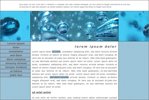
Figure 9: The finished site at 1024 x 768
Don't get scared now, you'll be surprised how straightforward such a layout actually is. The first thing to do is take a look at it and, leaving aside the image for the moment, think about what the major layout elements might be.
This is what you should come up with. I'm going to call these three parts the header, the main-text and the navbar.
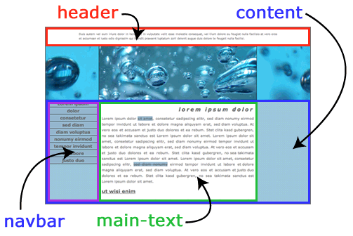
Figure 10: Identifying the layout elements
Now, I've kind of tricked you a bit there because to make this layout work you actually need an extra element which you can't really "see" just by looking at the web page in the browser. When you open up the HTML document though you'll see that there is an extra element, which I'm going to refer to as "content". It contains both the main-text and navbar elements.
Exercise 30
Open the XHTML document we're working with, and see if you can find the elements that correspond to the parts I have described above.
Don't forget, in real life, you'll have to create the HTML to go with your CSS from scratch as well, so this part of the tutorial is a little artificial.
Did you find the following?
<div id="header"><div id="content"><div id="main-text"><div id="navbar">
The <div>element with an id attribute
What type of elements are these? For those of you who haven't come across them before they are <div> elements with an id attribute, and they are the main building blocks used in CSS page layouts. A <div> is simply a generic HTML block element. This means you can wrap it around the different blocks of content you want to position on your page, just as we've done here. We then give the different <div>s unique id attributes so that we can identify them and give them positioning properties in the style sheet. Is your head spinning? Don't give up, this will be so much clearer once you've used it a few times in the exercises. The only really important thing to remember here is that ids must be unique in any single HTML document, otherwise your HTML is not valid. Let's go back to our style sheet
We select the different <div>s using what's called, funnily enough, id selectors. These take the following form:
#id-name
where id-name is the exact name used in the id attribute in the HTML.
Exercise 31
Create four new statements, with id selectors, for those four elements we want to position.
No need to worry about doing this - they'll already be there, along with a couple of others we'll be using later. For now, just isolate the ones I've referred to above and you're ready to start laying out the page. And here's how to create id selectors for when you need to do your own at some stage in the future.
To create an id selector
1. from the menu select and then .
The ID Selector Editor opens.
2. don't worry about any of the tabs - simply type the name of your id in the field on the bottom right
3. click
So, once you're done, you should have these four statements.
#header {
}
#content {
}
#navbar {
}
#main-text {
}
Finally, we're at the fun part, where you get to style each of these elements and position them on the page. Let's start with the header.
Both #header and #main-text are going to be positioned statically. This means they simply flow down the page, one after the other, in the same order as they occur in the XHTML. Now I know some of you will be saying "But that's not positioning at all!". If you are, just sit tight, you'll be surprised at how it all turns out.
Exercise 32
Start by making the background-color of the header white. This way you can see exactly where it is on the page.
Had you remembered how to do that?
#header {background-color: #ffffff;
}
Once you've done this take a look in the browser. Now that you can see where this element is, you should notice that it's sitting in from the edge of the page a little bit. We want it to go right to the edge, but why isn't it doing this? The answer lies with a new property, margin, which we're going to be using a lot here, and a default browser value for this property.
The margin property
The margin property lets you control the amount of space between each edge of an element and its adjoining elements.
What we're seeing here is a default margin being applied by the browser all the way around the <body>, which, if you remember back to the containment hierarchy we saw previously, contains all the other elements on the page. We can override this default by setting our own value for margin - in this case 0. The astute among you will no doubt say "0 what?", to which my answer is "It doesn't matter." 0 is the only length value where you don't have to specify units.
Exercise 33
Put a margin of 0 on the body statement and check the results in the browser.
To set the margin property.
1. make sure the cursor is inserted in the body statement.
2. open the .
3. type 0 in the middle field in the top editor - the one that says .
4. update the and see what's happening.
The #header should now be sitting flush against the edge of the window.
Note: Safari for Mac users may still be seeing a margin at the top of the #header, which doesn't appear on Windows Internet Explorer or other browsers I tested on. Don't concern yourself with it as it will disappear a little later on.
body {
...
margin: 0;
}
The border property
New properties are coming thick and fast now. Borders can be applied either to all edges of an element, or each edge individually. There are three characteristics of a border you can control.
- Its style, using values like
- solid
- dotted
- dashed
- double
- Its width, using all the usual length values. I like to use pixels.
- Its color, using the color values we've already seen.
There are a number of different ways of setting up borders in CSS. What I'm going to show you is the least complicated and, in my opinion, the most intuitive way of doing it. Use one of the four border property names
border(to apply to all four edges)border-topborder-leftborder-bottomborder-right
and then list values for its three characteristics, with spaces in between. So if I want to put a solid black border, 5 pixels wide, all the way round an element, I would use the following
border: solid #000000 5px
Or, if I wanted to apply a dotted red border, 1 pixel wide, to the left edge only I would use
border-left: dotted #ff0000 1px
Exercise 34
Put a solid 1 pixel wide black border on the bottom edge of the header.
Using the Style Master border editor is very straightforward: just make sure you've got the cursor inside the #header statement first.
1. Open the .
2. You'll see some tabs for the different border properties: bring the tab to the front.
3. You need to choose a border style before you can set any of the other characteristics: do this and you'll see the other editors become active.
4. Type the color value 000000 in the usual field on the color editor.
5. Set the width editor to 1px.
Is this what you came up with? And how's it looking in the browser? By the way, it doesn't matter what order the style , color and width are listed in, as long as they're all there.
#header {
...
border-bottom: 1px #000000 solid;
}
In terms of positioning that's it for the #header. Let's now take a look at that "invisible" element, #content. I call it "invisible" because in a sense you don't see it on the page in the browser. However, thinking back to the HTML remember it actually contains the #navbar and #main-text elements. What this means then is we can move it around on the page and #navbar and #main-text will remain positioned inside it or, more accurately, relative to its edges.
Relative positioning
What we want to do is position #content so it starts directly underneath #header, and then we can move #navbar and #main-text around inside it but no matter where #header ends, both #navbar and #main-text will appear to flow directly after it. To make #content have this effect you need to give it two new properties.
First we need to give it a position of relative. Relative positioning is in fact quite similar to static positioning: the element will simply flow down the page as it would normally, until you give it some positioning coordinates (that last part is actually what distinguishes relative from static). But, we're not going to use any positioning coordinates here. We're just going to give #content a position of relative because you need to do this to make the rest of the layout work. Don't worry about the ins and outs of why this is the case - for now just focus on getting the elements of the layout right.
Exercise 35
Give content a position of relative.
You'll find a popup menu for the position property at the top of the .
The width property
Now, to make the layout work specifically in Internet Explorer you also need to give #content a width. Doing this is in fact redundant because we will actually set the widths on the #navbar and the #main-text, and this would force the #content to have a certain width. However, it is valid and, as I said, the layout breaks in Internet Explorer if you don't do it.
Width is another page layout property that's really simple to use. You just set it using those length values we've used so much already.
Exercise 36
Set the width of #content to 779px, which will be the ultimate combined widths of #navbar and #main-text, including any borders and padding.
You'll find the width editor in the middle of the .
You should see something happen in the preview now: the text area will have become narrower. But it still doesn't look too promising does it? Sit tight because now we're finally ready to put #navbar and #main-text into their correct positions. You'll be pleased to know that there are in fact no new properties to work with here, just practice of what you already know.
It's always easier to see what's going on once you've given your elements their background-color. This way you can see more clearly where they begin and end.
Exercise 37
Give #main-text a background-color of white, and a 1 pixel wide solid black border, but only on its left, right and bottom edges.
#main-text {
background-color: #ffffff;
border-left: 1px #000000 solid;
border-right: 1px #000000 solid;
border-bottom: 1px #000000 solid;
}
A great leap forward: at last the text is actually readable!
Positioning with margins
Remember how you already used margins above to give the <body> a 0 margin right the way round? Margins can be applied to each edge individually as well, just like borders. To spell it out, the complete set of margin properties are
margin- to apply the same margin to all edges.margin-topmargin-leftmargin-bottommargin-right
Exercise 38
Set a margin of 198 pixels on the left edge of #main-text.
Just open the and enter the value - but don't forget to set the units popup to px.
#main-text {
...
margin-left: 198px;
}
Can you see where we're going to head with that navbar?
Absolute positioning
The #main-text and #header are positioned statically. But we don't need to specify this value for them because this is the default browser behavior: elements appear on the page according to their order in the HTML, but you can still modify their exact locations using margins. Indeed, #navbar is also being positioned this way at the moment because we are yet to give it a value for position. That's why it's still sitting up there above #main-text: if you look in the HTML source, you'll see that it appears before #main-text in the flow.
Absolute positioning is where you tell the browser to take an element out of the normal flow of the document and position it, using some positioning coordinates, with respect to its parent element, ie, the element which directly contains it.
We're going to absolutely position the #navbar element. What do you think its parent element is? If you said <div id="content"> you're right. What this means effectively is that we will be setting a position for #navbar with respect to the edges of that invisible #content element.
To position an element absolutely you need to do two things. First we tell the browser we want to use absolute positioning, by setting the position property to absolute. Then we set the position coordinates using combinations of the properties
- top
- left
- bottom
- right
all of which take the length values we are already familiar with. In this way you can say, for example, where you want to put the top edge of an element with respect to its parent element. Whew - that's a bit of a handful isn't it? An example, as always, will make it clearer. Say we want to position the element called #sidebar 100px from the top of its parent and 10px from the left.
#sidebar {
position: absolute;
top: 100px;
left: 10px;
}
Exercise 39
Position #navbar so it is flush against the top and the left edge of #content.
You'll find the properties you need on the . First set the position property to absolute and then you'll see the editors for the coordinates become active.
#navbar {
position: absolute;
top: 0px;
left: 0px;
}
Once you're done take a look in the browser. Notice first of all how #navbar is now flush against the top and left edges of #content. But perhaps more importantly, look what's happened to #main-text. Because #navbar has been taken out of the flow with absolute positioning, #main-text now appears to flow on directly after #header.
One thing's wrong though: why is some of the text of #navbar overlapping #main-text?
We need to add one more property.
Note to Safari users: you'll probably be seeing some pesky extra space between #header and #main-text, just like that above #header. Again, don't worry, it disappears a little later.
Finishing up
Remember we've already used this property before. Can you work this out though: how wide do we want #navbar if it needs to just fit snugly in the space between the left edge of #main-text and the edge of the page?
Exercise 40
Give #navbar the right width so that it will sit snugly between #main-text and the edge of the page.
How easy was that? Pretty easy once you work out that #navbar needs to be 198 pixels wide, ie, the same as the margin-left on #main-text.
#navbar {
...
width: 198px;
}
Time to take a bit of a deep breath again, because guess what? What you've just done is the essence of one of the major techniques for creating 2 and three column layouts with CSS. That's all there is to it. All you need do is work out which elements are going to be statically positioned and flow one after the other, and which are going to be taken out of the normal flow and positioned absolutely. You'll be surprised at how much you can achieve with just this simple technique.
This is another opportunity for you to leave the tutorial for a while, go away and create some layouts of your own, and get the hang of how it all works.
Next
Next up we're going to use a lot of the techniques we already know, with a twist, and add in some new background properties, to really bring the page to life with some creative use of images.